What is responsive web design (RWD) and why does it matter?
What does it mean for a website to be responsive?
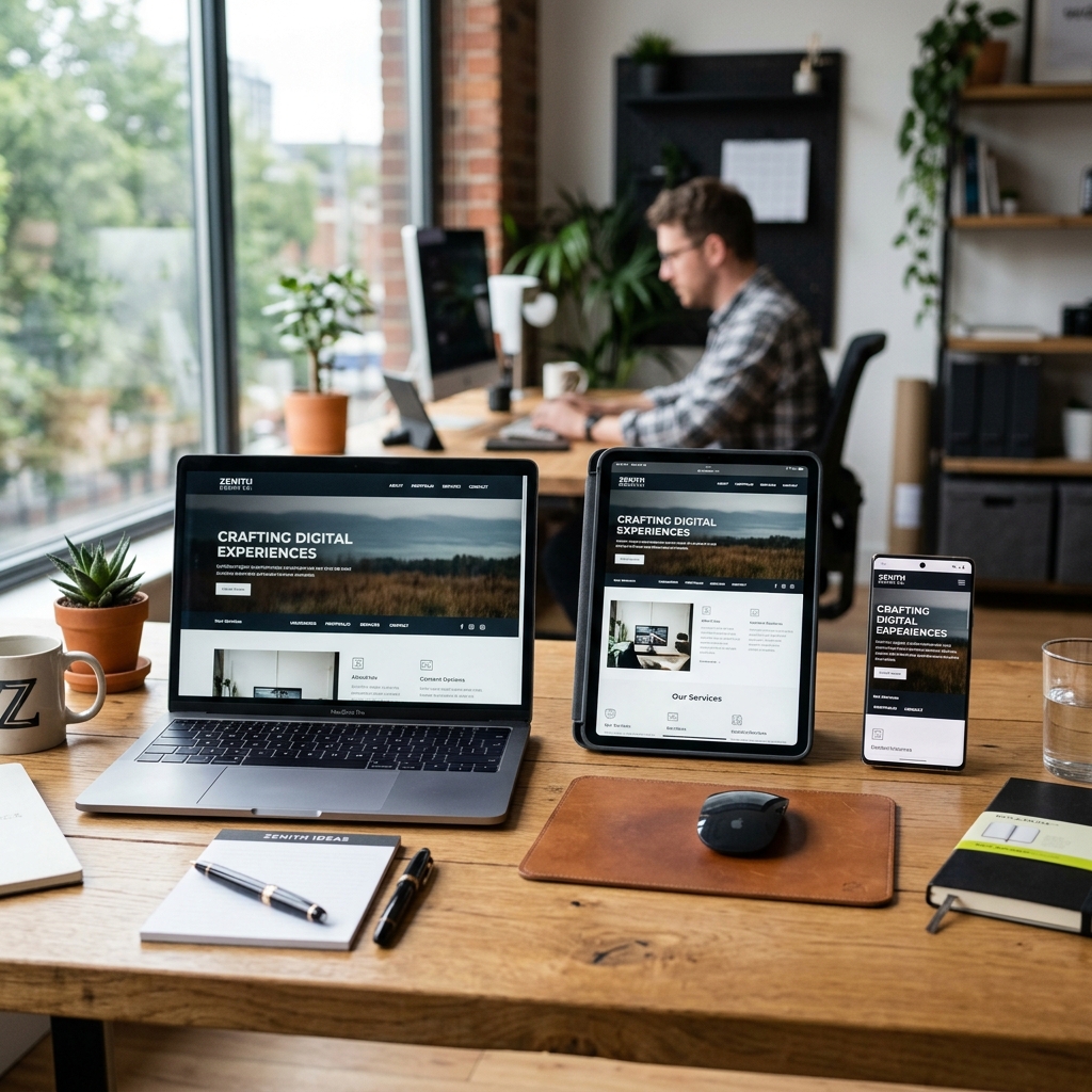
Responsive web design (RWD) is a way of building websites so their look and layout automatically adapt to the screen size of the device displaying them. As a result, the same website looks just as good and stays fully functional on a large 4K monitor, a laptop, a tablet or a small smartphone.
Key reasons you need a responsive website
- Most web traffic is mobile: More than half of global web traffic comes from mobile devices. When your website works smoothly on smartphones, it reaches the more than 50% of potential customers who browse on mobile, right from their first visit.
- Google requirement (mobile-first indexing): Google Search has applied the “mobile-first” principle for years. This means Google evaluates and ranks your website based on its mobile version. A responsive layout helps your website maintain and improve its search rankings (SEO).
- Positive user experience (UX): When visitors can read your text without zooming or scrolling sideways, they stay on your website longer and are more likely to buy or get in touch.
How we design responsive websites
At LifeDigital, we start every design with mobile users in mind. We use flexible grids (CSS Grid, Flexbox), images that resize to fit the screen and well-planned “hamburger menu” navigation, so your visitors get a smooth, professional experience on every screen size.